Bright colors stimulate the part of our brain that is responsible for creativity, for thinking up new ideas. Without a doubt the color schemes in our kitchens play a role in our lives. You will find brightly colored kitchens where the relationships are strong and warm, where all members of the household have a good sense of humor, express a positive attitude, and are active and friendly.
The combination of bright colors not only creates a special atmosphere in your kitchen, but also reveals the host’s character. Even though the use of intense colors demands not only stretching of one’s imagination but also exhibiting a prudent, cultured approach. But above all don’t be afraid to try bold experiments!
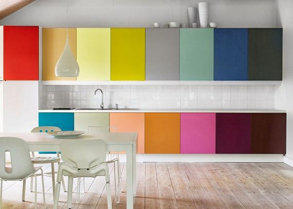
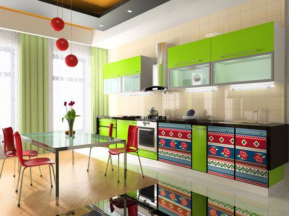
1. Rainbow colors
Enthusiastic eccentric and daring personalities will adore bold colors. Combining all colors of the rainbow into the kitchen cabinet veneers, accessories and even walls will come together so nicely. This design approach would suit perfectly well-lit rooms with less furniture/clutter; spaciousness is the key for this scheme to work perfectly. To finish the image it is best to use an area lighting scheme.
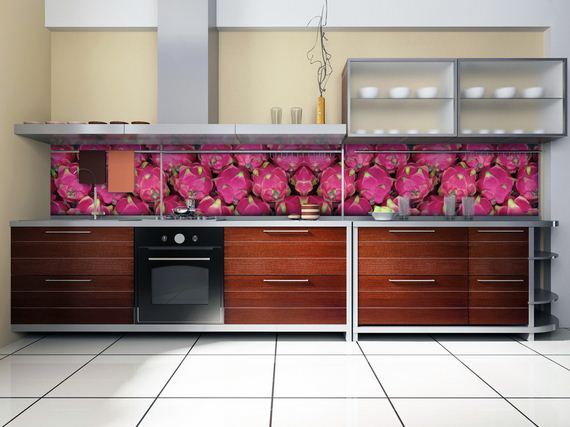
2. Make an accent
For those who are the “Type-A”, always-in-control person as regards major decisions but are not into flamboyant design, I would advice to make more subtle accents on just one or two of the walls. You may either paint or wallpaper. Still there are other possible ways for wall decorations. You can choose between posters, amazing wall decals, stickers for kitchen furniture and colorful wall murals. The open shelves on walls instead of traditional wall hung kitchen cabinets with doors, will highlight your ingenuity and imagination as well.
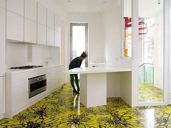
3. Bright Floor
In kitchens where light walls must dominate and you have more subdued furniture, try adding zest to the environment by installing a mosaic or solid color tile floor that will enhance the room ambiance and yet be a nice complement to the rest of the decor. Other options can be splashy linoleum or wood or imitation wood laminates that can offer amazing contrast to the subdued walls. There is a wide choice of floor materials nowadays. You will want to consultant with flooring professionals about the pros and cons, taking into account the general age of the building and the current condition of the kitchen floor. After choosing the material (tile, wood, linoleum, etc.), look through the different manufacturers. They offer wide range of colors, styles and grades of material. These days all of your wildest ideas can be brought to life.
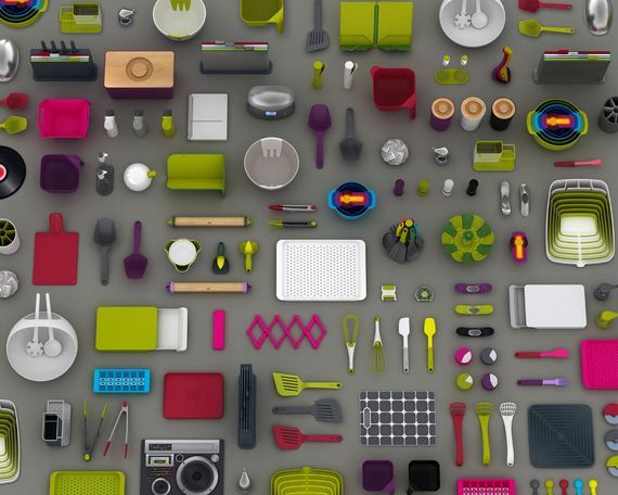
4. It’s all about accessories!
Plates, cups, glasses, hot pads, vases, flowerpots, books, spoons, scales, clocks, figurines, bottles, napkins, etc., all can do amazing things to colorize a room. Bold details will help to change the mood of interior design especially if you are still not determined about the color. You can easily change them any time not wasting too much money and they will help you define appropriate color.
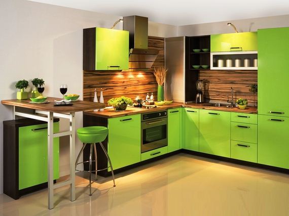
5. Go green!
The green color in your kitchen design will create a positive mood and atmosphere. It is a color of nature, harmony, relaxation and evenness – not humdrum but alive yet tranquil. And know that it always stays in style. If you are eager to make your kitchen more creative use different shades of green. If you are afraid it will be too much, just combine green with another color. But trust me, there cannot be too much or too little of this color. In addition, scientists believe that light green shades and colors in eating area allow you to eat right and you will be full after small portions.
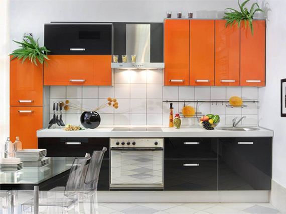
6. Make a contrast
Using a combination of contrasting colors in the interior of the kitchen, you need to be extremely cautious. For in this case, you risk making the kitchen design too aggressive or not in the best taste, where it becomes garish and out of control due to “over-coloring” In this case the room is not bright and interesting but is causes visual overload for all who come into the room. So avoid the flashy over-colorizing.
As in relationships where opposites attract, the combination of opposite colors in the spectrum can be a great decorating idea. This kind of high-contrast kitchen decor looks stylish and fashionable. The point of reference when modeling the kitchen design should be furniture. It has to be darker than the walls and lighter than the floor.
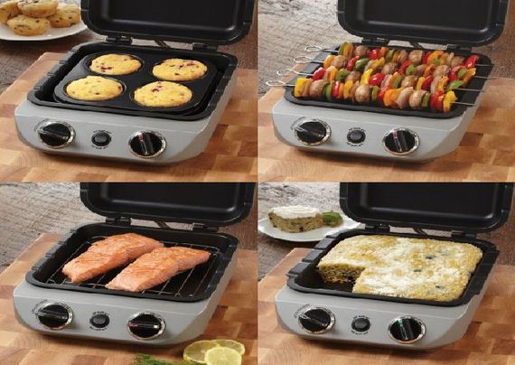
7. Gadgets
Still not ready for bold decisions? Not a problem! Give zest to your kitchen with the help of stunning accessories (the toaster, the blender, the coffee maker or kettle) can be matched to achieve something amazing to the eye. Nowadays famous brands provide wide range of colorful appliances.
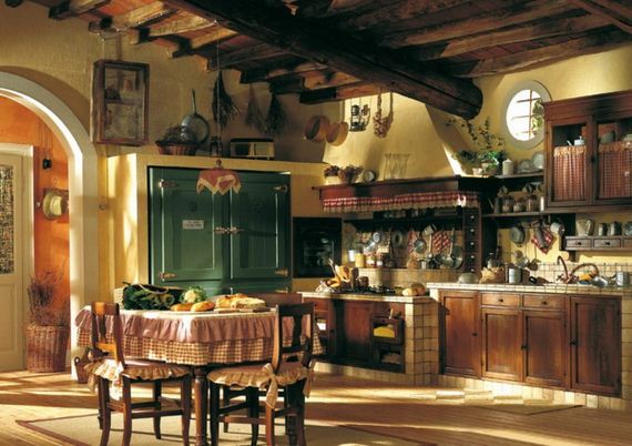
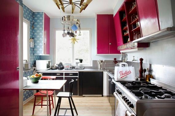
8. Enduring Designs
One of the most fashionable and tasteful designs over the years has been the French Country Kitchen and speaks to all the facets of designing a beautiful kitchen. It is all about color that will make your time spent in the kitchen among the happiest. This style of kitchen is all about open cupboards, high contrasting color and unbelievable style where your imagination can run wild as these two examples illustrate.
9.Coordinating/Matching Colors
White – combines the best with blue, red and black
Beige – Fits blue, brown and white
Gray – boring color that nevertheless, is the perfect base. It goes well with dark pink, red, purple and bright blue
Pink – this color suits brown, white, olive, gray, turquoise
Red – blends perfectly with the yellow, white, green, blue, gray and black
Brown – with bright blue, cream, pink, green, beige
Orange – with purple, blue, dark blue, violet
Yellow – blue, dark blue, purple, black, gray
Green – comes with a golden brown, yellow, black, light beige
Blue – with white, red, gray, yellow, orange, pink,
Dark blue – suits the purple, red , green, orange, yellow
Black – universal elegant color. Looks good with all the colors. Best combines with orange, pink, green, white, red and yellow.